


WGSN and Coloro name ‘Luminous Blue’ Colour of the Year 2027
WGSN and Coloro's Key Colours for SS27. Credits: WGSN / Coloro. “Both mysterious and eccentric” is how ‘Luminous Blue’ is described. The strong blue shade has been named Colour of the Year for 2027 by trend forecasting agency WGSN and its colour subsidiary Coloro, which simultaneously revealed their key colours for the SS27 season. According to WGSN’s senior colour strategist, Clare Smith, Luminous Blue comes with “versatility and a broad appeal that will resonate from occasionwear to active”. The choice of the potent tone aligns with the defining theme of 2027, interconnectedness between polarities, which the trend forecaster said would “allow palettes to balance functionality, practicality and innovation with contrary themes of amusement, spirituality and emotion”. In the duo’s report, it was also stated that there was evidence of a growing interest in colour and emotion, which has resulted in an increase in prominence among colours that “provide a sensory link to tradition, culture and wisdom”. As such, the companies’ choice of colour palette for the coming season consists of earthy and joyful pigments, each also intended to mitigate increasingly overwhelming pressures from “a polycrisis in 2027” that is expected to push people to search for community and nature. Overwhelming pressures in 2027 to drive sensory colours and joyful pigments With this in mind, Luminous Blue (Coloro code: 125–28–38) is joined in the palette by tones like ‘Energy Orange’ (Coloro code: 018–57–34), a “high-vibrancy hue that demonstrates resilience in the face of change”, and ‘Meadowland Green’ (Coloro code: 050–61–19), a mid-green that, akin to the orange, caters to the consumer desire for safety and protection. In the way of products, the orange refers to what will be an increased demand for adaptability, while the green intends to serve a “return to basics”. A similar sense of resilience is also present in ‘Clay’, (Coloro code: 014–60–13), a warm tone that is zoned in for its “cooling properties”, making it ideal when balancing functional materials with ancestral or futuristic qualities. ‘Pop Pink’ (Coloro code: 151–73–22), meanwhile, brings a distinct contrast in its playful appearance, meaning it will be “key to design products that promote both serious and unserious fun, enjoyable wellness and analogue amusements” for young and old consumers. In Pictures: WGSN and Coloro's SS27 Key Colour palette Luminous Blue (Coloro code: 125–28–38). Credits: WGSN/Coloro. ‘Energy Orange’ (Coloro code: 018–57–34) Credits: WGSN/Coloro. ‘Pop Pink’ (Coloro code: 151–73–22) Credits: WGSN / Coloro. ‘Meadowland Green’ (Coloro code: 050–61–19) Credits: WGSN / Coloro. ‘Clay’, (Coloro code: 014–60–13) Credits: WGSN / Coloro.
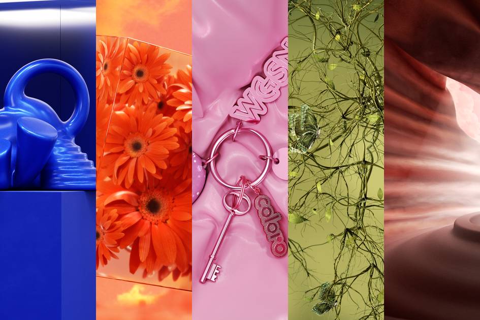
“Both mysterious and eccentric” is how ‘Luminous Blue’ is described. The strong blue shade has been named Colour of the Year for 2027 by trend forecasting agency WGSN and its colour subsidiary Coloro, which simultaneously revealed their key colours for the SS27 season.
According to WGSN’s senior colour strategist, Clare Smith, Luminous Blue comes with “versatility and a broad appeal that will resonate from occasionwear to active”. The choice of the potent tone aligns with the defining theme of 2027, interconnectedness between polarities, which the trend forecaster said would “allow palettes to balance functionality, practicality and innovation with contrary themes of amusement, spirituality and emotion”.
In the duo’s report, it was also stated that there was evidence of a growing interest in colour and emotion, which has resulted in an increase in prominence among colours that “provide a sensory link to tradition, culture and wisdom”. As such, the companies’ choice of colour palette for the coming season consists of earthy and joyful pigments, each also intended to mitigate increasingly overwhelming pressures from “a polycrisis in 2027” that is expected to push people to search for community and nature.
Overwhelming pressures in 2027 to drive sensory colours and joyful pigments
With this in mind, Luminous Blue (Coloro code: 125–28–38) is joined in the palette by tones like ‘Energy Orange’ (Coloro code: 018–57–34), a “high-vibrancy hue that demonstrates resilience in the face of change”, and ‘Meadowland Green’ (Coloro code: 050–61–19), a mid-green that, akin to the orange, caters to the consumer desire for safety and protection. In the way of products, the orange refers to what will be an increased demand for adaptability, while the green intends to serve a “return to basics”.
A similar sense of resilience is also present in ‘Clay’, (Coloro code: 014–60–13), a warm tone that is zoned in for its “cooling properties”, making it ideal when balancing functional materials with ancestral or futuristic qualities. ‘Pop Pink’ (Coloro code: 151–73–22), meanwhile, brings a distinct contrast in its playful appearance, meaning it will be “key to design products that promote both serious and unserious fun, enjoyable wellness and analogue amusements” for young and old consumers.