


![The F-35’s future: The power and cooling competition that could change everything [Video]](https://breakingdefense.com/wp-content/uploads/sites/3/2024/09/240924_F35_moon_USAF-scaled-e1727200160419.jpg?#)


Minimalist Magic: How to Decorate with a Neutral Color Scheme
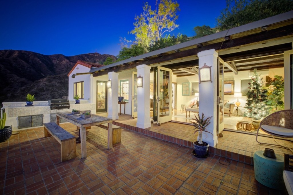
A neutral color scheme is the secret weapon of minimalist design, offering endless possibilities for creating serene yet striking spaces. Whether you’re in Portland, OR, layering cozy neutrals for a warm modern look, Atlanta, GA, adding bold accents for energy, or Denver, CO, keeping things sleek and simple, decorating with neutrals that pop can transform […] The post Minimalist Magic: How to Decorate with a Neutral Color Scheme appeared first on Redfin | Real Estate Tips for Home Buying, Selling & More.


A neutral color scheme is the secret weapon of minimalist design, offering endless possibilities for creating serene yet striking spaces. Whether you’re in Portland, OR, layering cozy neutrals for a warm modern look, Atlanta, GA, adding bold accents for energy, or Denver, CO, keeping things sleek and simple, decorating with neutrals that pop can transform your home into a stylish retreat full of texture, contrast, and effortless charm.
Benefits of a neutral palette
A neutral color scheme goes far beyond bland or uninspired. In fact, it’s a foundation for thoughtful, serene design that encourages clarity and comfort. According to life coach Paloma Chiara, “Our physical environment directly influences our mental clarity and emotional state.”
She recommends soft, neutral tones that reflect calm and openness. Adding layers of natural textures, like linen, raw wood, or stone, brings subtle warmth and grounding energy to a space, making it feel both minimal and deeply nurturing.”
Elm & Iron Home Goods echoes this sentiment, noting that “neutrals bring brightness and warmth to a space when there are considerations to texture, lighting, and mixed materials.” Thoughtful combinations — vintage with new, marble with stone, fabric with leather — keep the space dynamic and layered, rather than flat. These tactile contrasts create a room that is bright yet cozy, airy yet anchored.

Colors that define a modern neutral space
Today’s neutral color scheme includes far more than just beige and gray. Sara Streeter Pham of MICHE, a boutique hospitality design firm, suggests including “not only creamy whites and beiges but other neutral colors like deep brown, French gray and putty, camel, pale mauve, and navy blue, develop a rich, layered palette.” She recommends layering reclaimed wood, marble, and other natural materials to introduce richness and textural contrast. “A neutral palette inspired by hotel design can add a sense of refined elegance to your home,” Pham explains.
Tam of Awake Décor shares a similar view. “We don’t think of neutrals as beige and boring. We see them as a base for creating calm, spa-like spaces that feel fresh and lived-in.” She prefers warm taupes, seafoam, dusty rose, and rich green as subtle additions that preserve balance while introducing character. For Tam, her goal is “to create spaces that feel soothing but never sterile.”
Interior designer Barry Wooley adds that “Neutral backdrops need to do more than just blend in — they should serve as a canvas for personal expression.” His advice? Layer in unexpected color moments to avoid sterile or generic results, especially in builder-grade spaces, “to bring warmth, vibrancy, and individuality to a space.”

Utilize natural fabrics and fibers
“Neutral doesn’t have to mean boring — especially when you bring in natural fibers and layered textures,” Suzan Steinberg, of Stonemountain & Daughter Fabrics, says. “Linen, cotton, and silk in varied weaves add warmth, movement, and depth while keeping the palette calm and inviting. Sewing something yourself — or choosing pieces made with care — adds a personal connection to your home.”
Jordyn D’Andrea of Havens Furniture recommends soft, textured elements like boucle, linen, and light wood to “add warmth and depth. To make a neutral color scheme feel fresh and inviting, focus on soft textures, layered light tones, and natural materials.” She adds that brushed brass or soft gold finishes provide a refined finish without dominating the space. Soft accents in muted sage or taupe offer subtle contrast and richness.
Monica Guarnaschelli, owner of Indigo Mavens agrees that texture makes all the difference. She urges designers to embrace the natural beauty of materials: “veining of quartzite, the evolving patina of unlacquered brass, the stunning grain of walnut, the beautiful variation in a natural marble mosaic.
This bathroom is a great representation of a neutral palette that still offers a ton of visual interest, through a thoughtful curation of materials. Though color is minimal, quiet pattern and luxe texture are the hero of this design,” she says.

Add texture and lighting
Rustic House Furniture Store emphasizes the importance of layering. “When you’re decorating with neutrals, texture is everything,” they say. “We love combining natural wood pieces, like a solid sideboard, with woven baskets, linen runners, or a soft rug. Warm lighting from a well-placed lamp also goes a long way in making the space feel inviting.”
Logan Gibbons of Hadley Dobson Architectural Interiors takes it further, recommending vintage finds or heirloom accents that add soul and a sense of story. “Layering textures to create depth and interest — think natural linens, worn leathers, warm woods, and subtle stone finishes,” brings “warmth and authenticity, making the room feel curated and collected.”
Kelly Frere of Bliss Home Market emphasizes that “building a strong neutral foundation is essential for a well-balanced space.” Texture is a focal point in their neutral spaces, from pillows to artwork to throws. “Spending money on those core pieces for your spaces allows for depth and interest to enter in through the smaller items like rugs, lamps, and pillows.”

Add a pop of color and personality
Color isn’t absent in a neutral palette — it’s intentional. Iris Lockridge of Iris Lockridge Design emphasizes how a neutral base lets architecture shine, “whether it’s the millwork, ceiling details, or the way natural light enters the space. A well-done neutral is beautiful on its own, but it also sets the stage for layering in your personal style. Pops of pattern, rich textures, or quirky little trinkets: Those touches help bring the space to life. I always say your home should feel like you.
As a classical figurative painter, Caroline Nelson suggests to “Add richly colored, decorative pieces as accents around your interior. Consider accenting your cabinet hardware with gold metals if your interior is a more natural grey. “Richer colors that go very well with neutrals but wouldn’t overpower your color scheme are deep forest greens, earthy browns and reds, golden ochre yellows and satiny ultramarine blues. These colors are naturally occurring in our environment and are so pleasing to the eye that they would not shock the quieter tones of your interior.”
Keep it interesting
To prevent neutrals from falling flat, Erin Zierfuss of Common Thread Interiors recommends layering not just color and texture, but also detail. She envisions a slipcovered linen sofa, a vintage-style rug, and a chunky knit throw — all bathed in light from natural fiber lamps or a rattan chandelier. “Even a quiet, neutral palette gets our full creative attention,” she adds.
Accessories play a vital role in a neutral color scheme. “Sea glass, driftwood, and a vase of monstera leaves can reinforce the neutral palette while adding organic texture and visual interest.” These elements contribute to a home that feels curated and classy, rather than formulaic.
The post Minimalist Magic: How to Decorate with a Neutral Color Scheme appeared first on Redfin | Real Estate Tips for Home Buying, Selling & More.